Teacher Activity Reports Dashboard to give teachers proficiency data and a direct review workflow for the content the platform can't auto-grade: recordings, open-ended responses, and student annotations.

Product Name
Emerge!
User
Teachers, Administration
Role
End-to-end Lead UX Designer
Team
TPM, Academic Designers, Engineering
THE CHALLENGE
Teachers had no meaningful way to see how their students were actually progressing through activities.
Teachers need a fast, reliable way to see how each student is progressing through digital activities. The current platform offers only raw completion data with no way for the teacher to view student data for each activity page including student outcomes, if the student viewed or did not view the page, and any open-ended submissions. Additionally, the teacher cannot preview the activity without emulating a student.
The specific obstacles were significant:
No page-level outcomes: only binary viewed/not viewed data, with no way to distinguish understanding from guessing
Student work was invisible: recordings, open-ended responses, and annotations unreachable without leaving the reports workflow
No activity preview: teachers had to emulate a student account to understand the context behind the data
The math reporting model didn't fit: literacy has a different data model and teachers needed to review word
WCAG accessible: data visualization can be complex and difficult to make completely accessible
MY ROLE
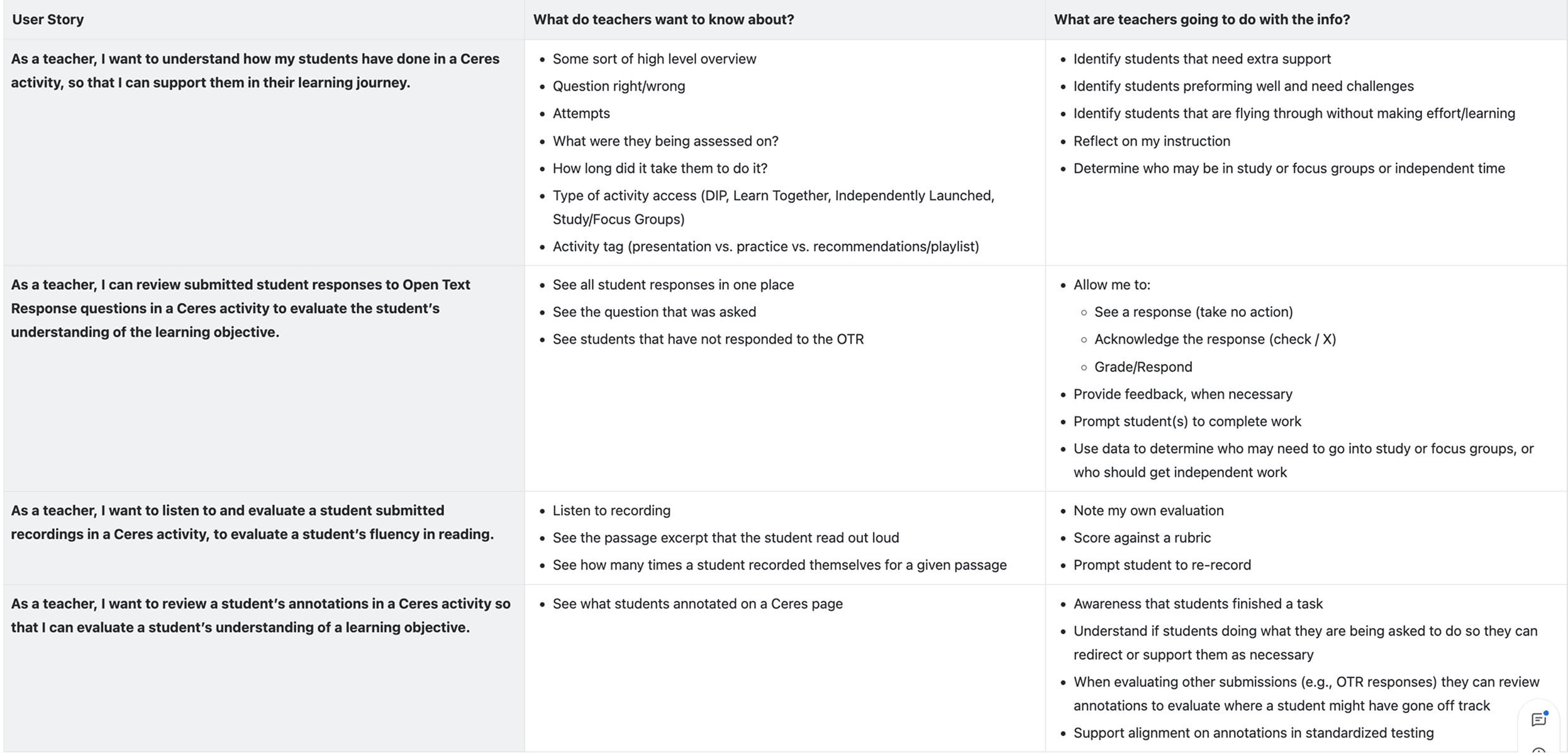
I was the sole designer on this project, working end-to-end from discovery through engineering handoff. Cross-functional collaborators included a TPM, academic designers, and product, who I worked with closely to define the student status taxonomy, as well as an ongoing teacher advisory board whose monthly sessions with the product team provided direct teacher input on reporting needs throughout the process.
DISCOVERY & FRAMING
Starting with what already existed
McGraw-Hill's Open Learning platform already had a mature activity reports system for its math products, built by another designer on the reports and analytics team. I met with the designer who had built it to understand the reasoning behind their decisions, and separately met with the UX manager for reports to flag any upcoming work that might affect the direction I was heading.
This was a deliberate risk-reduction decision. Teachers using New Literacy would be entering into the New Literacy program through the Open Learning Dashboard that already contained reports and besides that, they were most likely already using existing McGraw-Hill products. If my reports felt fundamentally different from what they'd seen elsewhere in the platform, different navigation patterns, different data hierarchies, different visual language, that inconsistency would create cognitive friction every time they switched contexts. I needed to understand what was worth carrying forward before I could make a principled decision about what to change. I also needed to determine what was working and what could be improved.
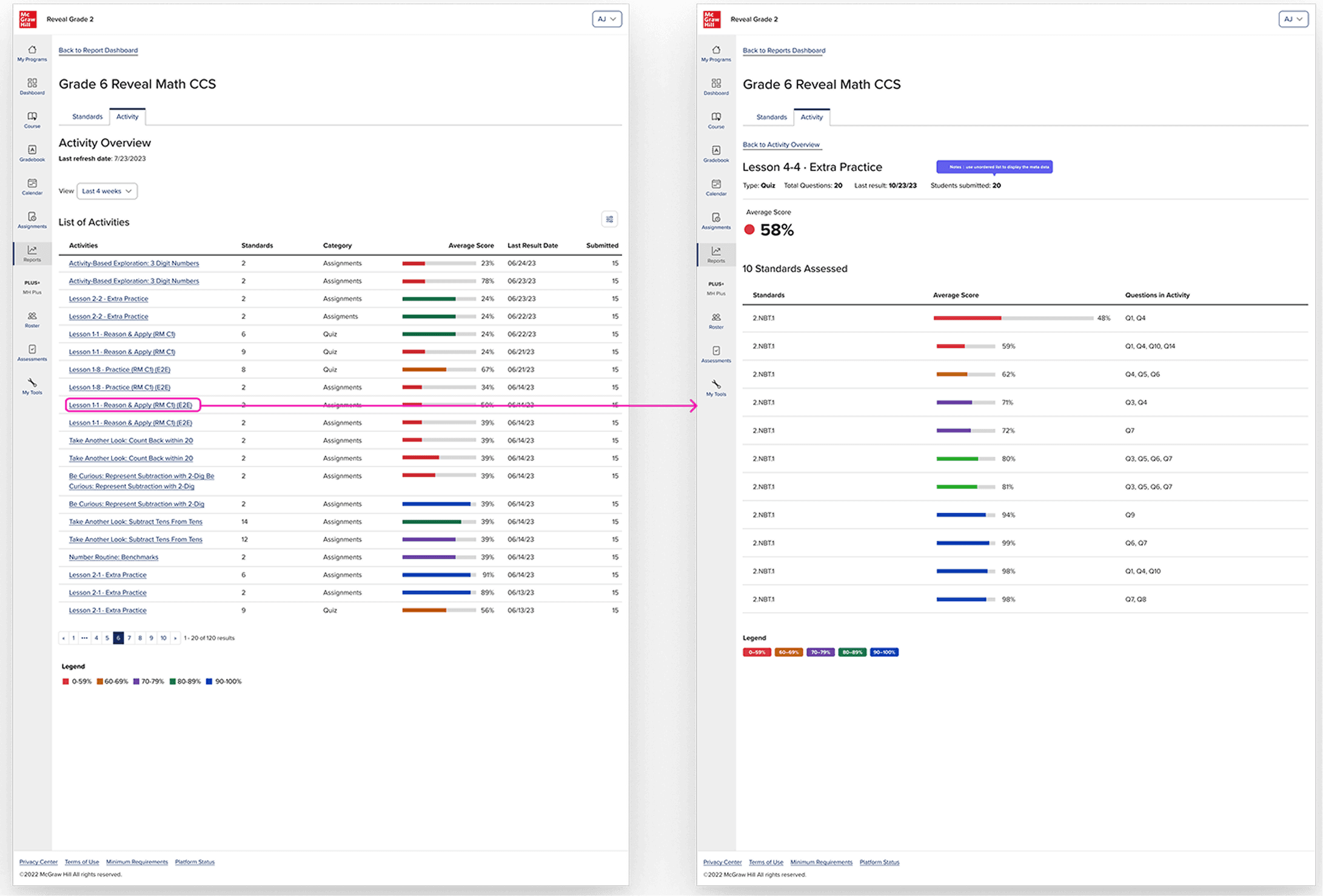
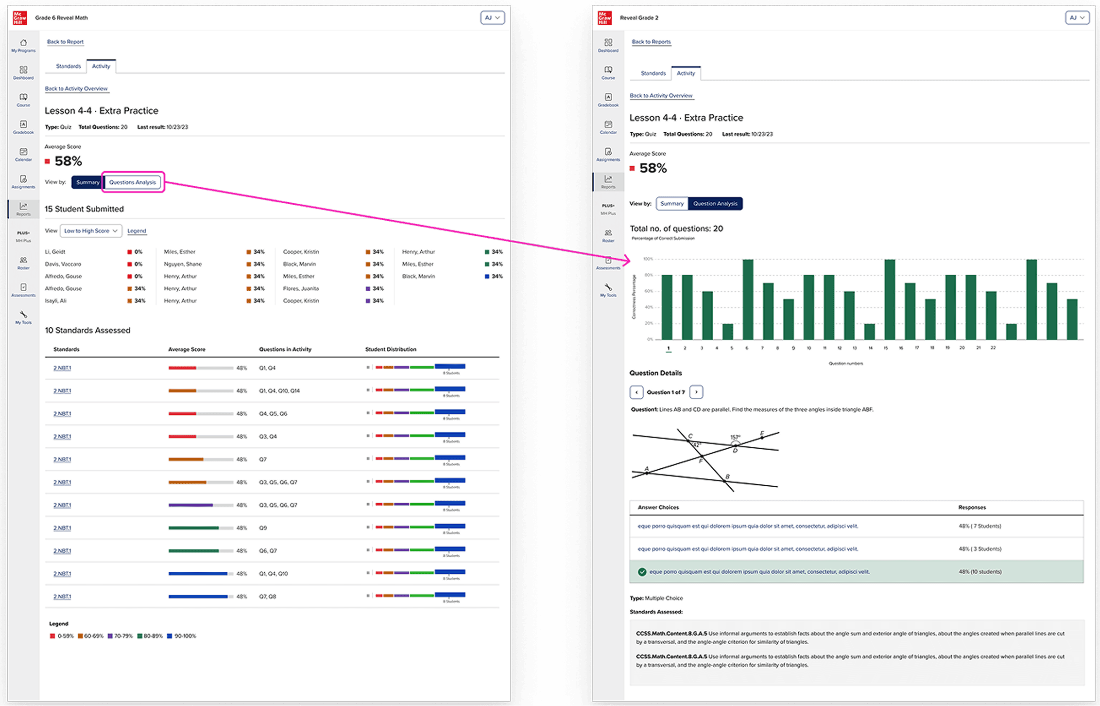
The existing system was well-designed for what math reports need: a ranked list of activities, each with an average score represented as a percentage, color-coded by performance band, with the ability to filter by standard or category and drill into per-standard breakdowns. For math, this works. Performance on a quiz question is reducible to correct or incorrect. A percentage is a meaningful summary.
There was also this existing assignments report that was used to track if students had completed the assignments as well as a place for teachers to input scores. This felt like a relevant experience to review internally beforehand as well as it required teacher intervention more than the other reports I took a look at.
What existing reports couldn't do
The existing system was built around a straightforward data model: a student answers a question, the platform grades it, the teacher sees a percentage. For math, this is sufficient. Performance on a discrete question is reducible to correct or in correct and a percentage is a meaningful summary of where the student lands.
Literacy tends to be more complex, not because scores don’t matter but because not everything in a literacy is scorable by a binary correct/incorrect and the platform itself cannot interpret certain responses that are more subjective. In this literacy platform, students are required to record themselves reading the passage aloud for reading fluency. They might annotate a text with their thinking. They might write an open-ended response that requires a teacher’s interpretation, not that of an algorithm. These are not edge cases in a literacy curriculum, they are central to how reading comprehension is actually assessed.
A report that only returned a percentage couldn’t support any of these. The design problem wasn’t to replace proficiency data, it was to build a report that also delivered teachers a direct path to act on the content that required their judgement.
THE APPROACH
The data drove the design
The key design decision wan’t to abandon scores, it was to build a status taxonomy rich enough to describe every type of page in a literacy activity, including the ones that don’t have a right answer.
Working with the TPMs, academic designers, and product team, and we defined six statuses.
Correct (first try)
Correct (after retries)
Incorrect
Submitted / Needs review: for open-ended responses and recordings that require teacher evaluation
Viewed: for instructional pages where engagement is the signal, not correctness
Not viewed
These six statuses could hold the full range of what a literacy activity asks students to do. They could also drive teacher action: "needs review" is a queue, not just a data point.
But statuses alone weren't enough. The existing system summarized data at the activity level. For a literacy teacher, that's too coarse. A single activity might span fifteen pages, some instructional, some with auto-graded questions, some with recordings, some with open text.
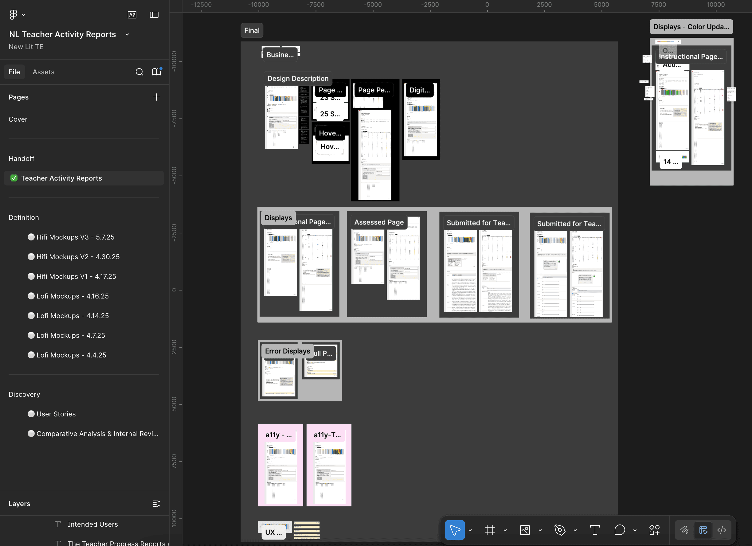
Lo-Fidelity Mockups
There were ongoing conversation with the product leadership team discussing the necessary parts of the teacher reports. This lucid chart from a product manager, with a lo-fi wireframe of all the different necessary elements of the reports was developed to try and visually represent how a report could look like.
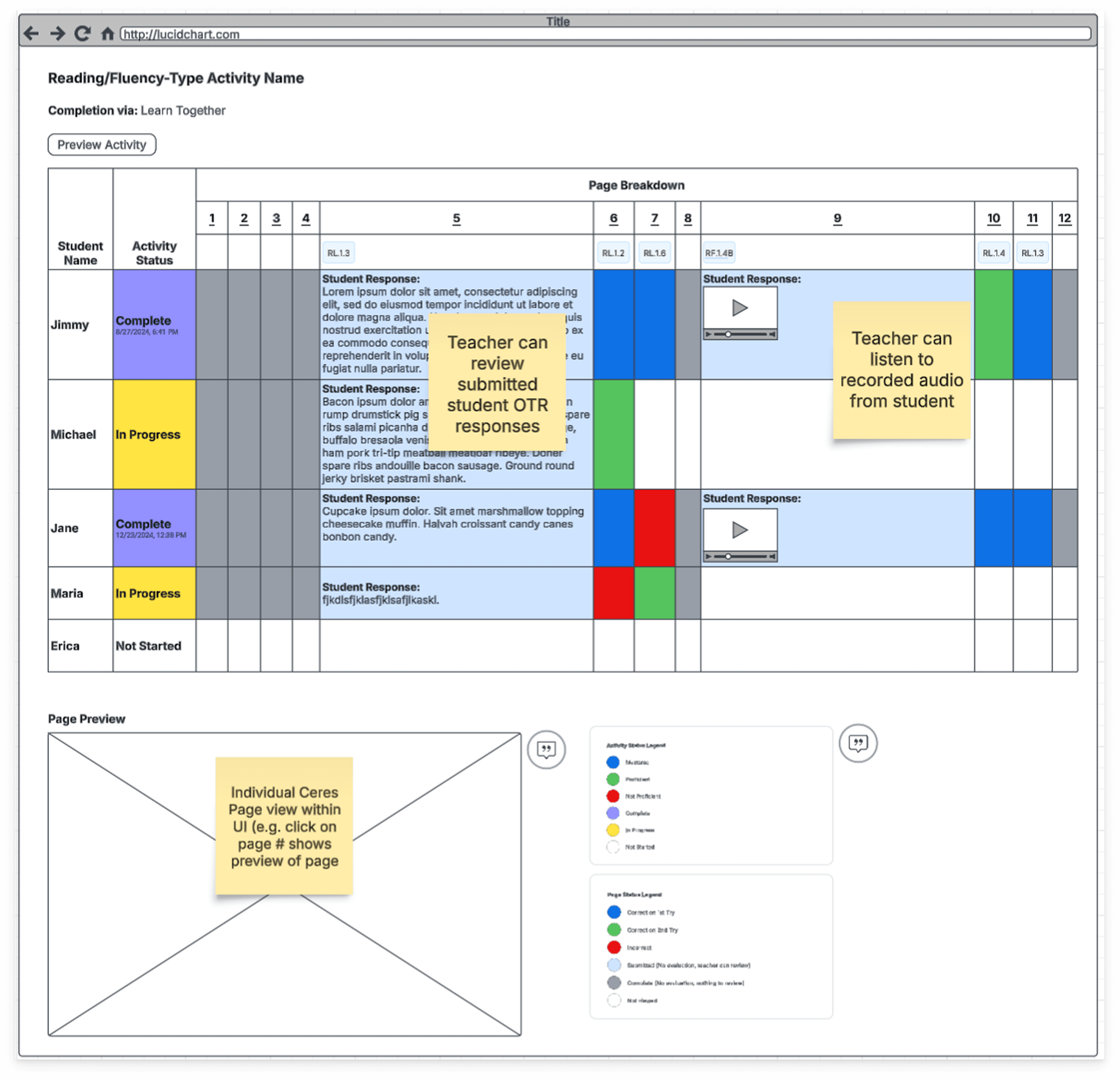
I had some concerns about the cognitive overload for the teacher and also the number of potential rows and columns that could eventually populate in the report. So, I went ahead and did a round of rapid iterations that had the lo-fi wireframe above in mind. Usually ,I do my quick iterations in gray scale, however we were having to take into account a color-based legend and we also knew that it would live in the existing reports UI, so it made more sense to start in color, so it was more mid-fidelity.
After several iterations, I presented these mockups to stakeholders and it was quickly agreed that the grid view that was initially proposed would not serve the teacher well, as they would have to sort through all of the symbols and then also the report would most likely require a horizontal and a vertical scroll. Cumbersome to say the least. As a former teacher, I was also not a fan.
Visual data exploration
So then the question became, how can we surface all of the relevant data for the teacher without completely overwhelming them? They had to be able to get an overview of the students' performance, but also be able to drill into the student work so that they could review open text responses, annotations on pages and voice recordings. All while trying to stay within the bounds of the existing reports style, it couldn't be truly radically different. Also, the reports had to be WCAG accessible. A true challenge indeed!
This is my favorite part of the design process, the problem-solving through collaboration and exploration. Here are a few:
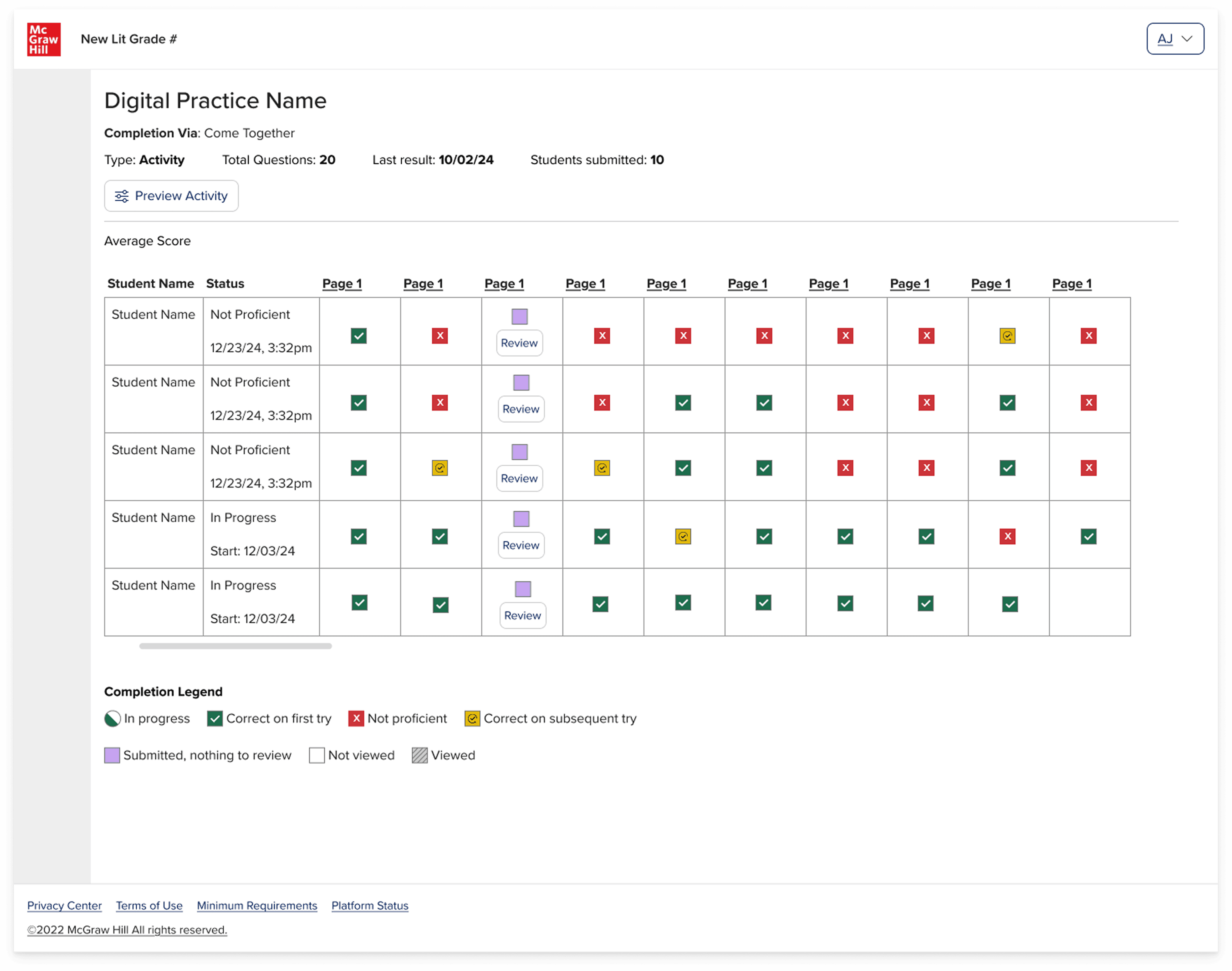
After several rounds of iterations, I advocated for the bar graph solution as teachers would be able to see the whole activity holistically as well as having the ability to drill into the activity page specifically to review student responses. If the bar was gray, then they knew that the page was just something the student had to read. If the bar was purple, then they needed to manually review the student work because it was some type of non-binary response. And then if the bar was red, green, yellow, then they could comprehensively see the class performance breakdown by clicking on that question number or bar, and they would see the content below shift to reveal that activity page content and students' responses.
It wasn't just a visualization of the data, it became something more dynamic: an interactive experience that allowed the teacher to decide how far in they wanted to go.
Refining the direction
After stakeholders agreed in the bar graph direction, I continued to iterate on it and collaborated with engineering and accessibility to figure out the best way that we could make this experience interactive for the teacher.
This is also where I started to dive deeper into the use case of the open text response and voice recording responses that teacher would need to review.
Adjusting for edge cases
As I was iterating on the designs, the question came up: what if there are multiple open text responses on an activity page?
In that moment, there was not yet a known use case of there being multiple text responses or voice recording on an activity page. However, it was an important question to ask because it is a known pattern in the classroom for a worksheet to have multiple sections for the student to write, so this could come up eventually within the activity.
This led to a smaller exploration exploring some options, including a pagination and tabular structure. The tab structure was ultimately decided upon after considering the following factors:
Pagination:
Tab:
THE SOLUTION
The activity report
The NL Teacher Activity Reports convert raw activity logs into an interactive dashboard that shows every page of an activity as a stacked bar ( X = page order, Y = number of students), segmenting students by six clear statuses: correct first try, correct after retries, incorrect, submitted/needs review, viewed, or not viewed, while a one‑click toggle reveals the same data in a WCAG‑compliant table for full accessibility.
There were 4 different scenarios:
Instructional page (non-assessable)
Assessable page (assessed by the system)
Open text response, submitted for teacher review
Voice recording, submitted for teacher review
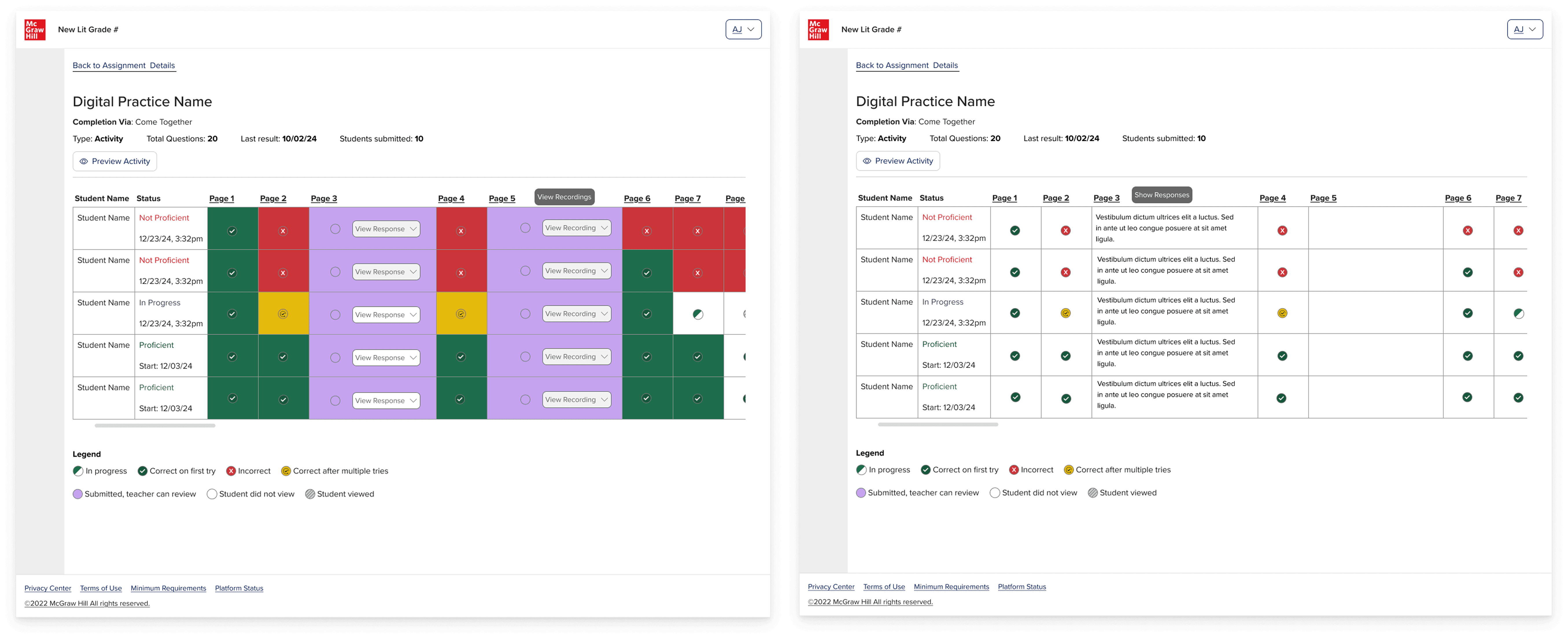
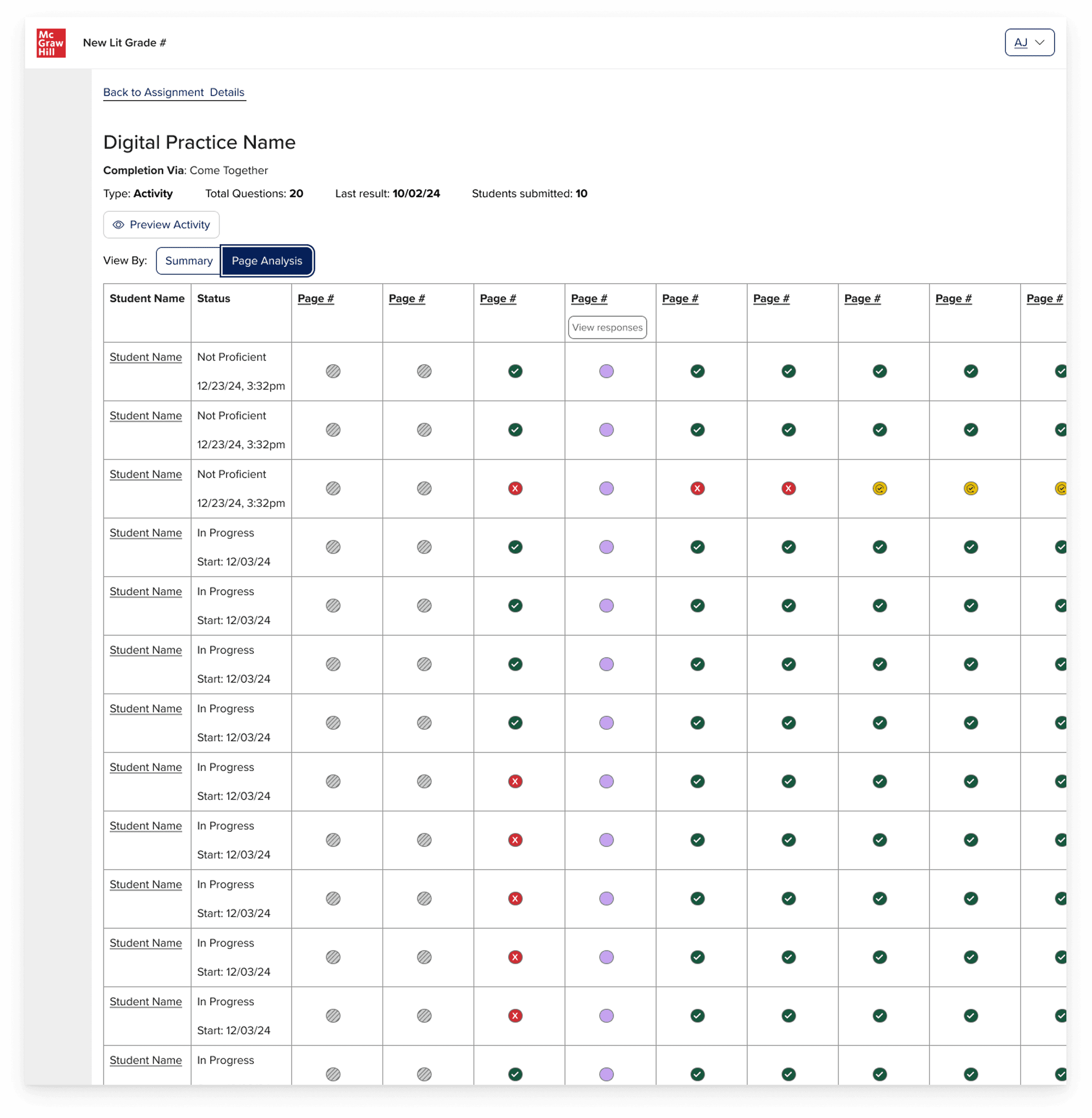
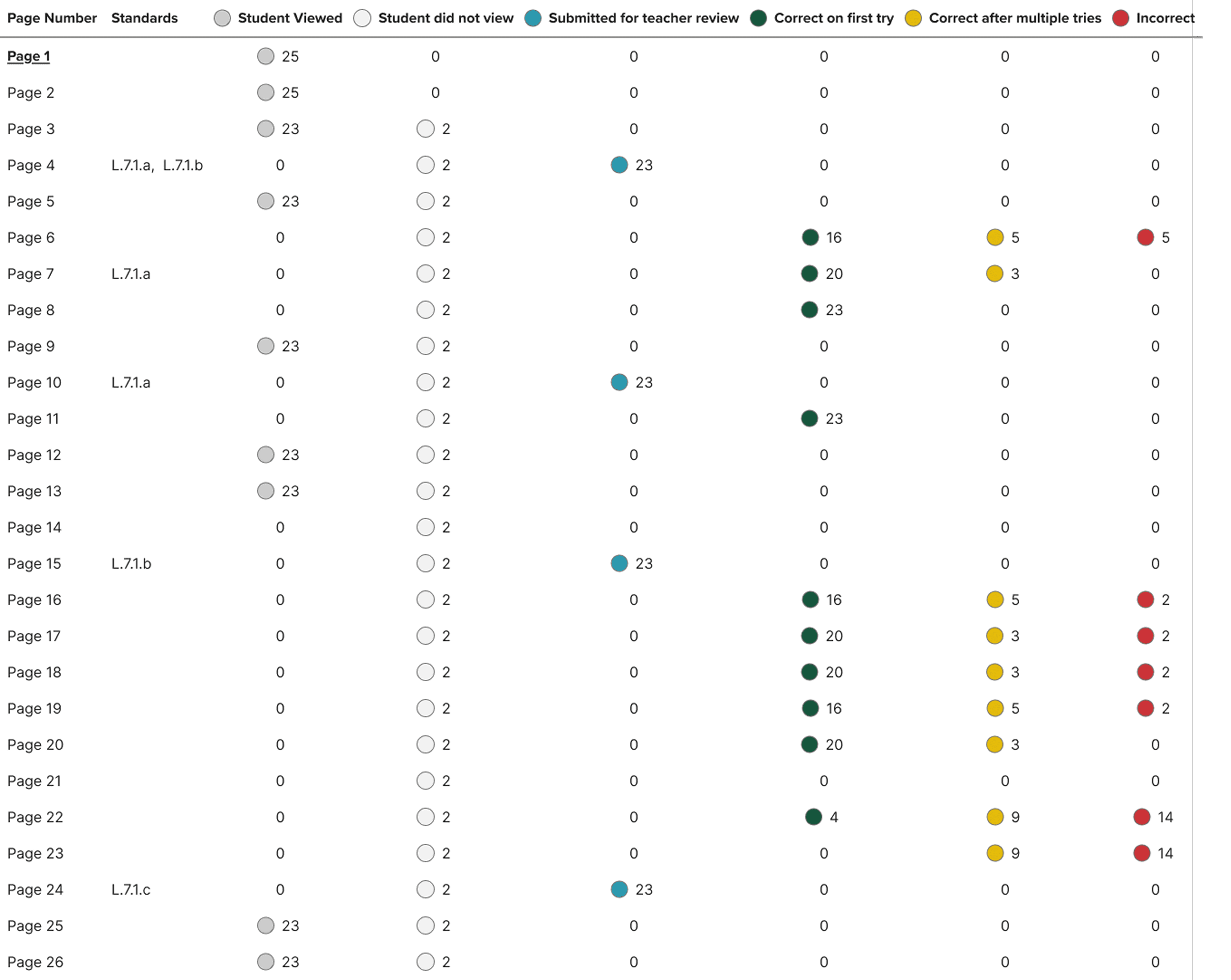
The report had a toggle, which the teacher could use to navigate between the bar graph and a table view.
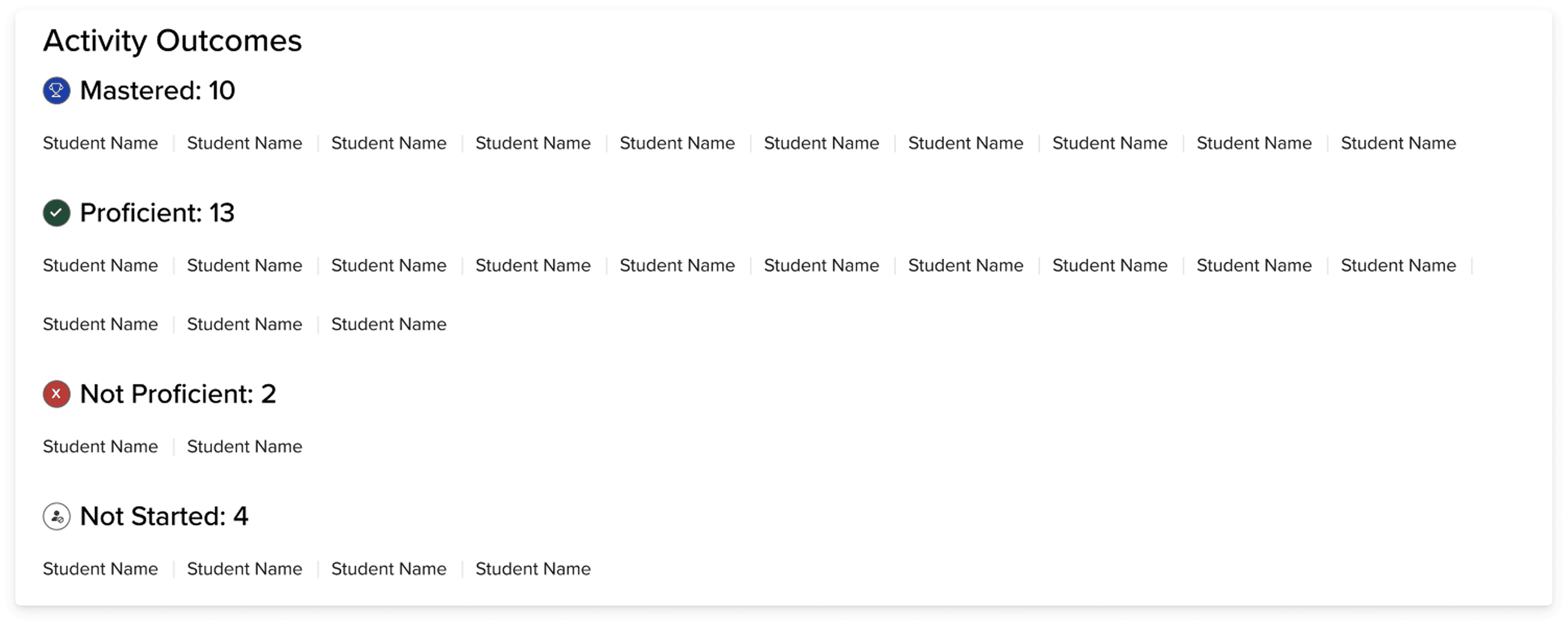
Activity outcomes
A section at the top called "activity outcomes" groups students depending on their proficiency or whether they had completed the activity or not. If the activity page has responses that the teacher must review or there is no student response, then there are just: completed and not started. However for the activities that are system-reviewed, the following outcomes are shown:
The bar graph
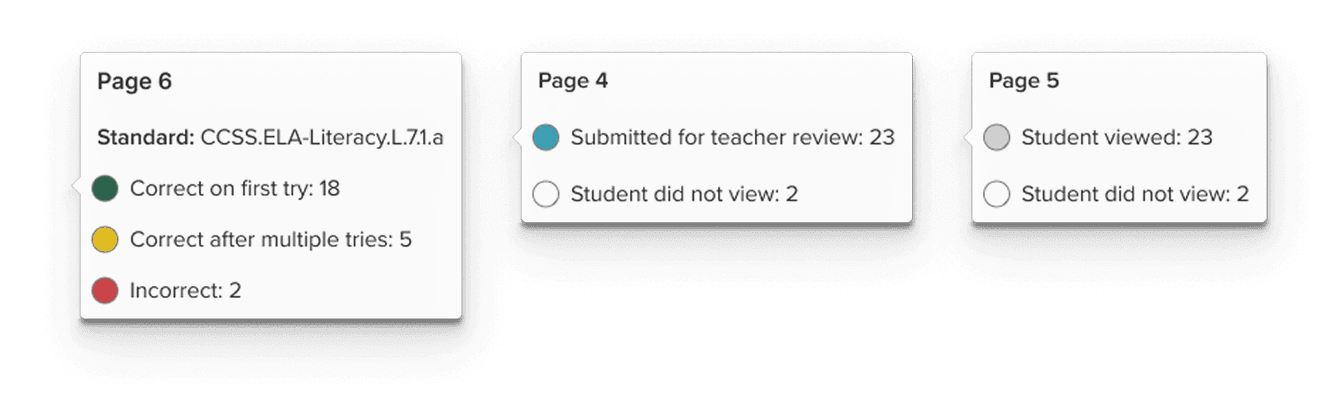
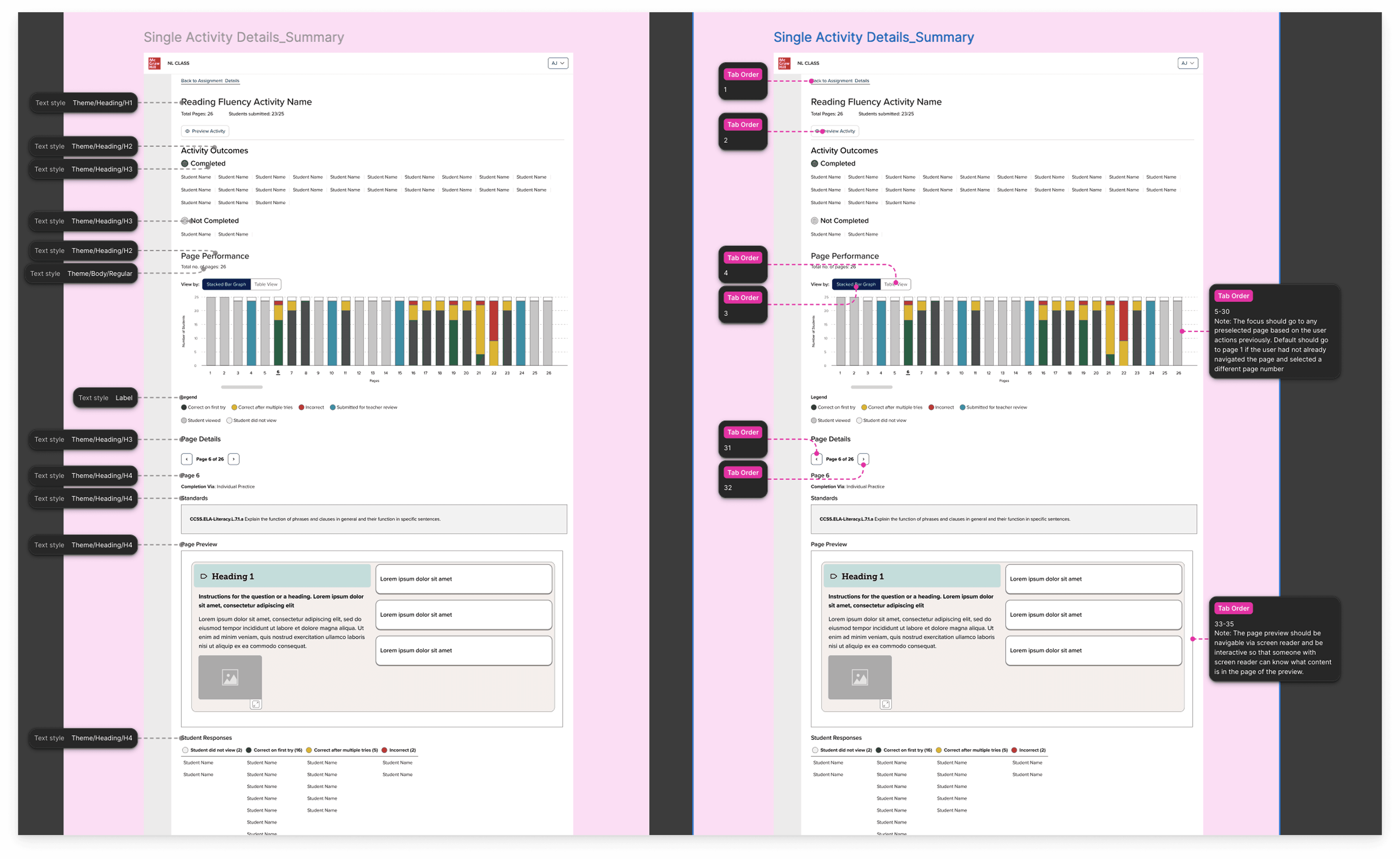
Clicking any bar or table row opens a page-detail panel without navigating away from the overview. The panel surfaces: standards alignment for that page, a live preview of the activity page itself (resolving the teacher's need to understand context without emulating a student), and a sortable grid of individual student results.
When the teacher hovers over any of the bars in the page performance graph, a tooltip appears to give them more information about the page, as well as student data and any standards that are associated with the page content.
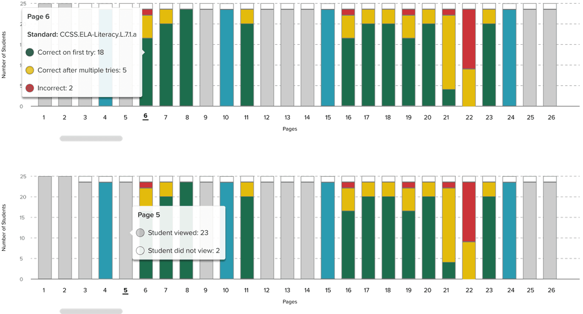
The colors were not enough for the bar graph, even if there was a legend, so I made sure to add in a tooltip that on hover would provide the teacher with explicit explanation of the color system.
The table
A toggle is available to the teacher so that they can view the bar graph data in a table format. Although we used Highcharts, which had accessibility built into the bar chart, I also included a table view since the layout of a table tends to be easier for tab navigation for those using keyboard navigation. It also helps teachers who want to see the information represented numerically instead of visually.
Giving these two options to the user provides them with more agency in their own experience.
Handoff and Figma Organization
The handoff document for all of my projects, include this one includes a breakdown of the design from high level business goals to the details of the components:
Accessibility
Handoff to engineers also included accessibility annotations. Accessibility was part of the conversation from early on and I already had some prior experience in accessibility with data visualization from previous projects that I was able to apply.
The accessibility team recommended that we use Highcharts, which offers accessible charts and graphs and this is the path we followed.
OUTCOME AND IMPACT
Teacher visibility of whole class and whole activity
The teacher advisory board, a group of active classroom teachers who met monthly with the product team, responded directly to the product team. Their feedback was unambiguous: this was information they had been wanting. The ability to see page-level progression, access student recordings and open-ended responses without leaving the reports context, and identify students in a "needs review" queue without manually chasing submissions named specific pain points they'd been working around for years.
Beyond the teacher response:
The six-status taxonomy provided a common language across the product and engineering team, a single model that could describe any page type in the literacy curriculum without special-casing
Full WCAG AA compliance was embedded from the start, including the table toggle as an accessibility-first alternative to the visual bar chart
The design went through the full cycle from internal research, lo-fi exploration through hi-fi to fully, accessibility review and spec'd out/annotated engineering handoff in two sprints (while I was working on 2 other teams)
WHAT I LEARNED
Getting creative within restraints
The most important decision I made on this project was the one I made before I opened Figma: going to understand the existing system before building a new one
It would have been faster to start from scratch. And it would have been a mistake. The comparative analysis didn't just prevent inconsistencies, it forced me to articulate why the existing system was built the way it was, which meant I could make a principled argument for where and how a literacy report needed to diverge from it.
The status taxonomy taught me something related. In education products, the temptation is to reduce everything to a score, because scores feel objective and legible. But a score is only meaningful if the underlying task is scoreable. Designing around that constraint, rather than ignoring it, led to a reporting model that was actually more useful to teachers than a percentage would have been.
Future of the product
There’s a future version of this report where AI could reduce the review burden significantly. For example, flagging recordings that fall below fluency benchmarks, surfacing patterns in annotations, pre-scoring open responses against a rubric before the teacher ever opens the queue. The efficiency gains are real.
But as a former teacher, I hold that possibility with some hesitancy. Grading was the part of teaching that I liked least. It was also the part that taught me the most about my students. Sitting with students’ written and spoken responses was often the moments in which I understood where their thinking had gone sideways, what misconceptions were underneath a wrong answer, what gap I need to go back and fill through instruction and additional supplemental resources
View Projects
Book a free call