A digital split-screen reading experience for grades 6-12 that brings the familiar classroom dynamic of a book and an activity sheet into a digital environment.
Product Name
User
Role
Team
The Challenge
Designing without a complete picture
McGraw-Hill needed a digital reading experience for grades 6–12 that honored the pedagogical logic of the physical classroom: the intuitive rhythm of a book on one side and a worksheet on the other, moving between thinking and responding without losing your place. Translating that to a screen meant more than replication. It meant using the digital medium to go further.
The specific obstacles were significant:
No fixed reference point: the student interface didn't exist when external vendors began building, so authoring and student design had to proceed in parallel
Everything was still in flux: annotation tools, graphic organizers, and long-form writing were being scoped by separate teams simultaneously
No dedicated researcher: the PM, a fellow designer, and I had to step in to moderate usability sessions ourselves
Accessibility from day one: WCAG AA had to be embedded throughout, including a floating annotation palette requiring full keyboard navigation
Two grade bands, one designer: the 6–12 experience had to be designed in parallel with a structurally different K–5 model, with shared features that had to work across both
My Role
I was one of two designers on this project, collaborating closely on the 6–12 split-screen experience while simultaneously owning UX for the K–5 product, the authoring tool, and the teacher experience. My scope included the student reading interface, annotation system, panel control logic, and accessibility layer. I also co-moderated usability research sessions alongside the PM and a fellow designer when the research team didn't have capacity to lead them alone.
DISCOVERY
Teachers had already validated a split screen experience.
I took over this project after teacher research had already been completed by another designer. In a project full of open questions, that research gave me the structural anchor I needed before a single screen was designed.
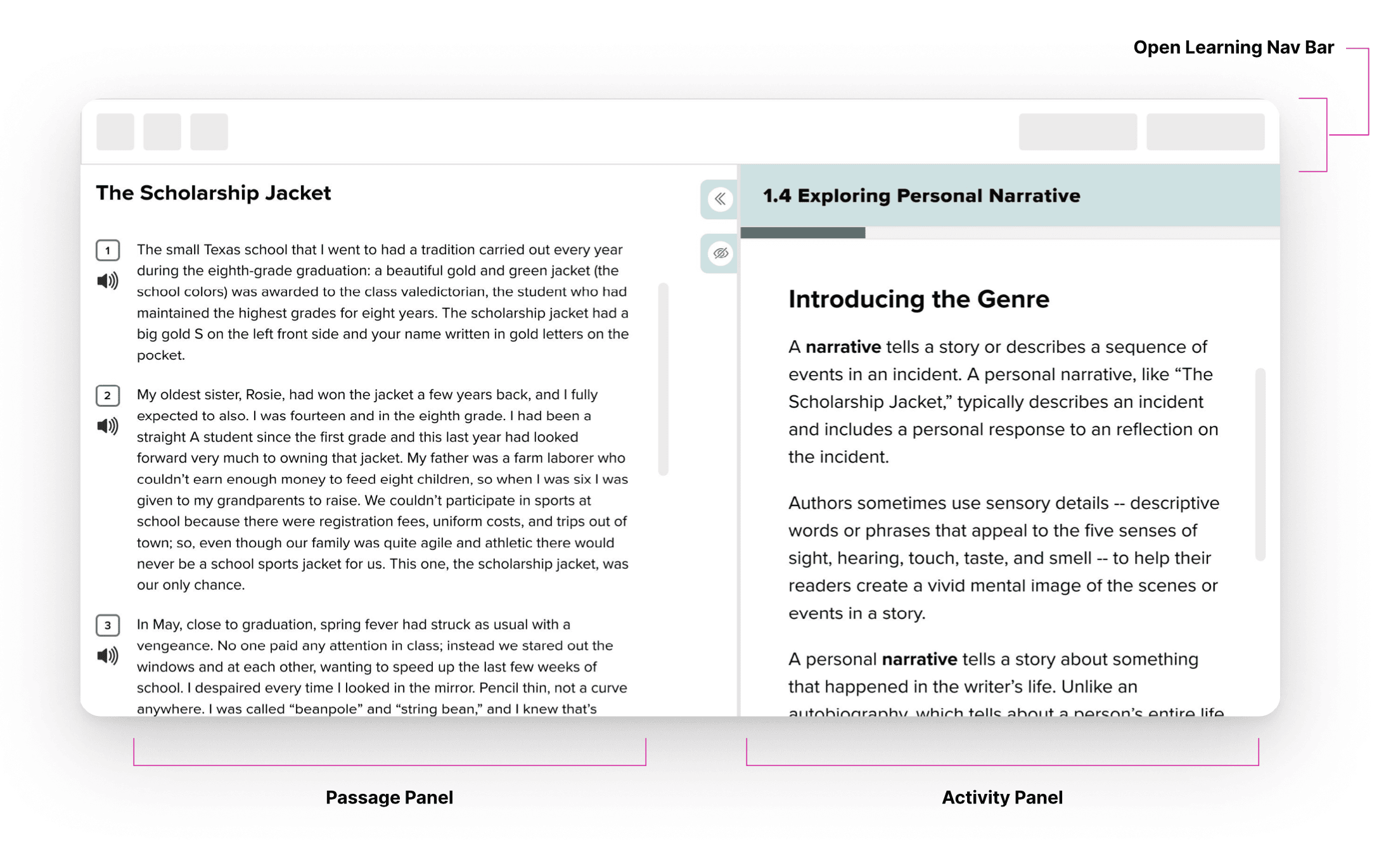
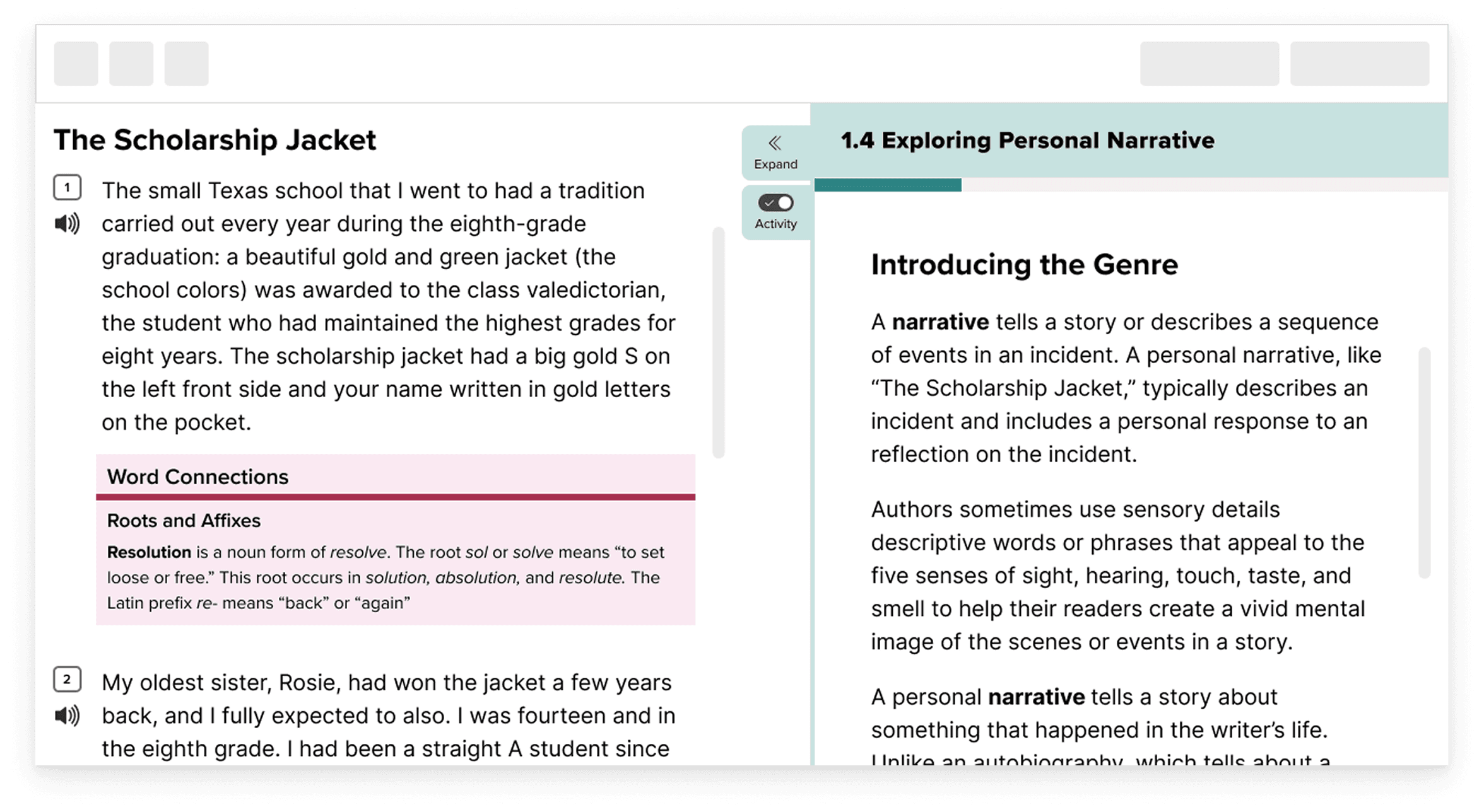
Teachers described the side-by-side experience of a physical book and worksheet not as a design preference, but as a pedagogical need. A student who has to close a book to answer a question, or who loses their place in the text every time they switch tabs, is a student whose cognitive load is working against them. That insight became the structural principle for everything that followed: passage left, activity right, with the ability to move between them without friction.
Comparative Research
I mapped the competitive landscape across eight reading platforms, looking at annotations, content organization, audio, progress tracking, and platform access. A few patterns stood out. Most competitors defaulted to inline questions embedded directly within the text rather than a dedicated activity panel, a simpler approach, but one that fragments the reading experience by constantly interrupting it. The split-screen layout was rare. On annotations, the market was fragmented: student highlighting was common, but full annotation suites were sparse. There was no dominant pattern to learn from, which meant we were making deliberate choices in territory most products had left unsolved.
THE APPROACH
Designing while user content was also being developed.
One of the defining constraints of this phase was that almost everything was still in flux: the toolbar between panels was a placeholder, the pencil icon gestured at annotation functionality still being scoped, the graphic organizer and long writing experience were in active development by separate teams, and the Notes feature hadn't been decided. Rather than wait for every answer, I designed for the shape of the problem.
Mapping out the user flows provided an asset that could be shared with engineering and other stakeholders to refine user stories, find edge cases and align as a team as a whole before tackling the actual visual wireframes. This was a repeated process whenever a new feature was integrated into the base split screen student experience.
Ideal User Flows
User flows were the first step to help conceptualize the product experience holistically. It took the requirements documentation from a page of words to an output that gave a clearer idea of the user journey and could be used to facilitate technical conversations with engineering to identify technical feasibility or edge-cases or issues that would have otherwise come out later. This step also was incredibly helpful in reducing scope creep.
Lo-Fidelity Prototyping
The first low-fi explorations were about establishing structural logic, how the two panels would relate, how a student would move between reading and responding, with enough flexibility for the details to fill in as other work-streams matured. It was an exercise in designing with confidence under ambiguity, which in a project this size is less an exception than a constant.

I keep rapid iteration quite loose, using the split screen as the base and exploring the different possbilities for control positioning and anticipating where future features could live as well. The following features had to be considered:
Annotations
Highlighting
Comments/Notes
Graphic organizers
Passage gating and scaffolding
Audio controls
Multi-passage controls and shortcuts
Jump-to skip links
During the lo-fidelity process, I included engineering and other stakeholders once I had a more-defined ideas and used Loom to help facilitate asynchronous design reviews and feedback rounds. View part of one of the walk-throughs below:
Mid-Fidelity/High-Fidelity Wireframes
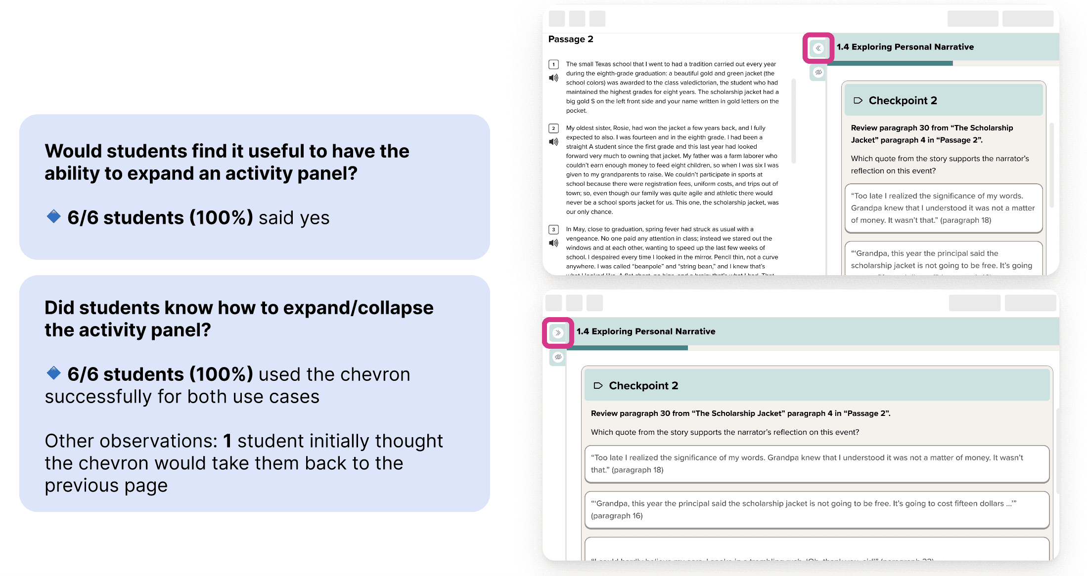
Moving into mid-fidelity, controls shifted to the center gutter, a narrow strip between the two panels that belonged to neither side. This felt closer to right. The gutter became a neutral zone: present when you needed it, invisible when you didn't. Back and Next buttons were already part of the activity page templates, this couldn't be changed due to technical constraints, and it was consistent with already existing pattern. The difference in the updated version, is that the back/next buttons were moved into a sticky footer instead of having to scroll all the way down the activity page to find them.
But two things remained unresolved: the icons for expanding and collapsing the panel weren't landing with users, and the scope of what else would live in that gutter: annotation tools, graphic organizers, audio controls and other features still in development, was still an open question.
Refined design for user research sessions
After several rounds of lo-fidelity and mid-fidelity designs and reviews with stakeholders, the experience was refined and a prototype was created to test with students.
USER RESEARCH
Not enough UX Researchers. So we adapted.
As a team, we wanted to validate our direction with research, specifically with students since we already had the teacher validation. Although we had budget, the research team didn't have bandwidth to moderate. So we divided the work: the research team handled recruitment, and our PM, a fellow designer, and I split six moderated sessions between us over Zoom.
The sessions were conducted with 6th and 8th graders, to see where perspective and comprehension diverged. Getting to talk directly with students let me bring two parts of my background together: my teaching experience, which shaped how I communicated and listened to kids; and my UX research training, which kept the sessions structured and the insights actionable.
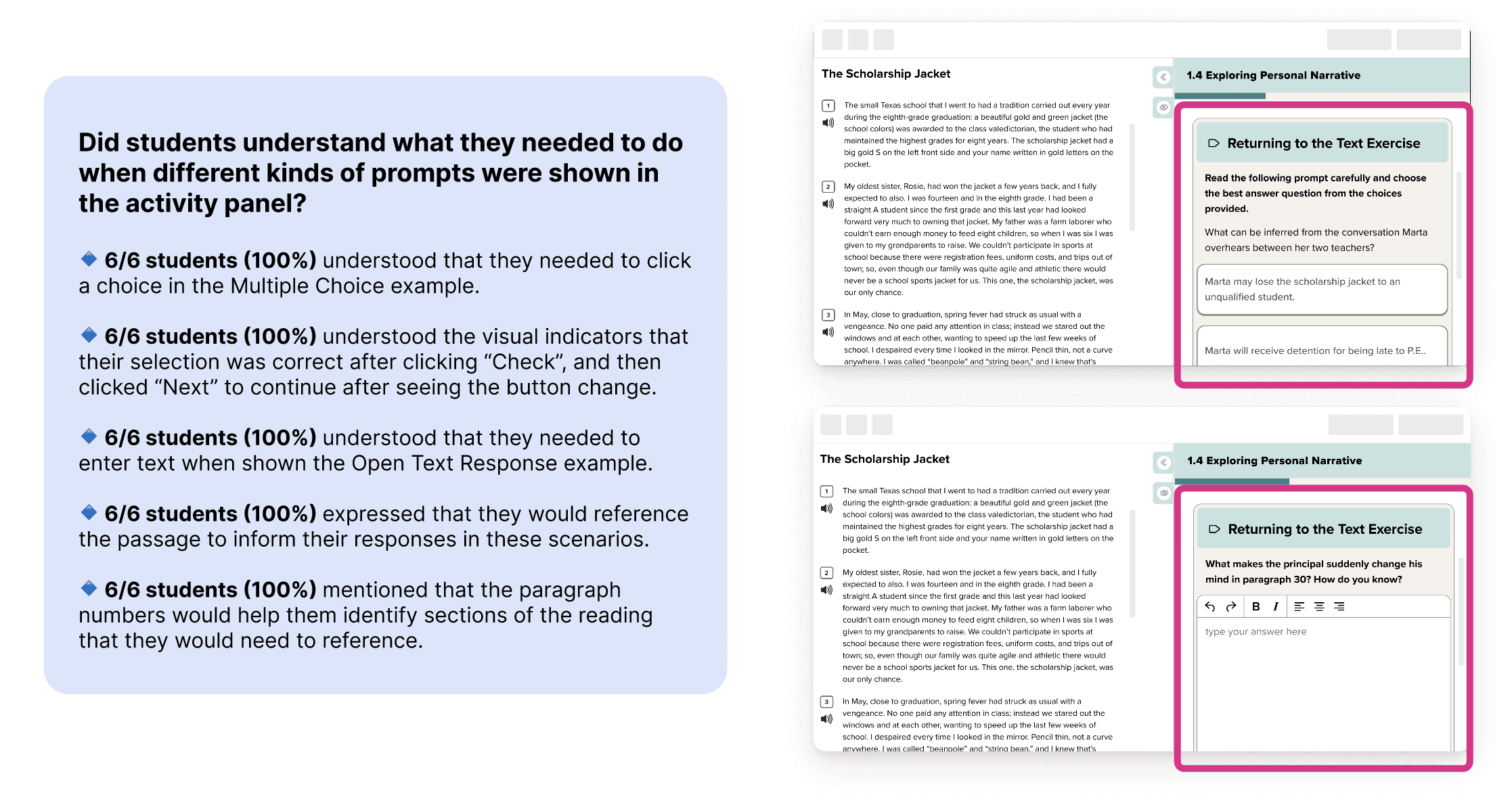
Central research question: Does the split-screen activity, its layout, navigation logic, panel states, and progression model, make sense to students on its own terms, without instruction?
Primary Goal | Secondary Goal |
|---|---|
Validate that the split-screen interaction model was intuitive to students without instruction, reducing product risk before engineering handoff. | Surface student mental models around annotation so the feature could be designed around existing expectations, not against them. |
The session scenario grounded students in a realistic classroom context: your teacher just assigned this activity on your Chromebook. That framing shifted students from "testing a prototype" to "doing an assignment," which surfaced behaviors that a more abstract session wouldn't have revealed.
Design Updates Based on Research
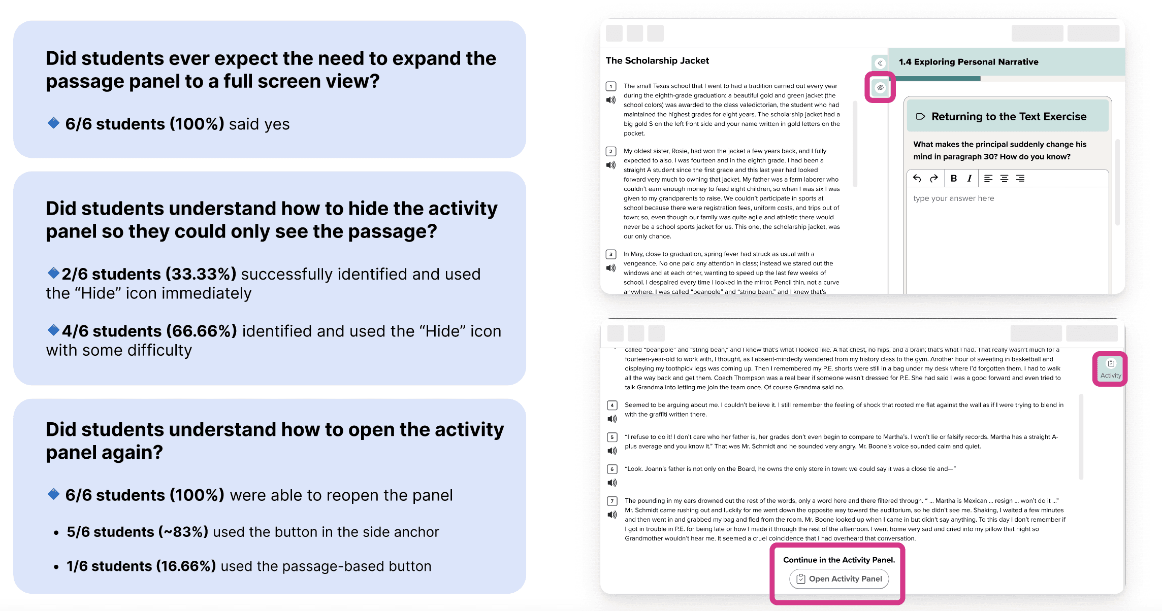
Ensured that when students navigate backward, they are anchored for the corresponding passage associated with the previous pages for easy reference
Revisited "Hide Panel" control to clarify iconography
Added tooltip labels for the control buttons for better identification
FEATURE COMPLEXITY
A Multi-Feature, Multi-Layered Product
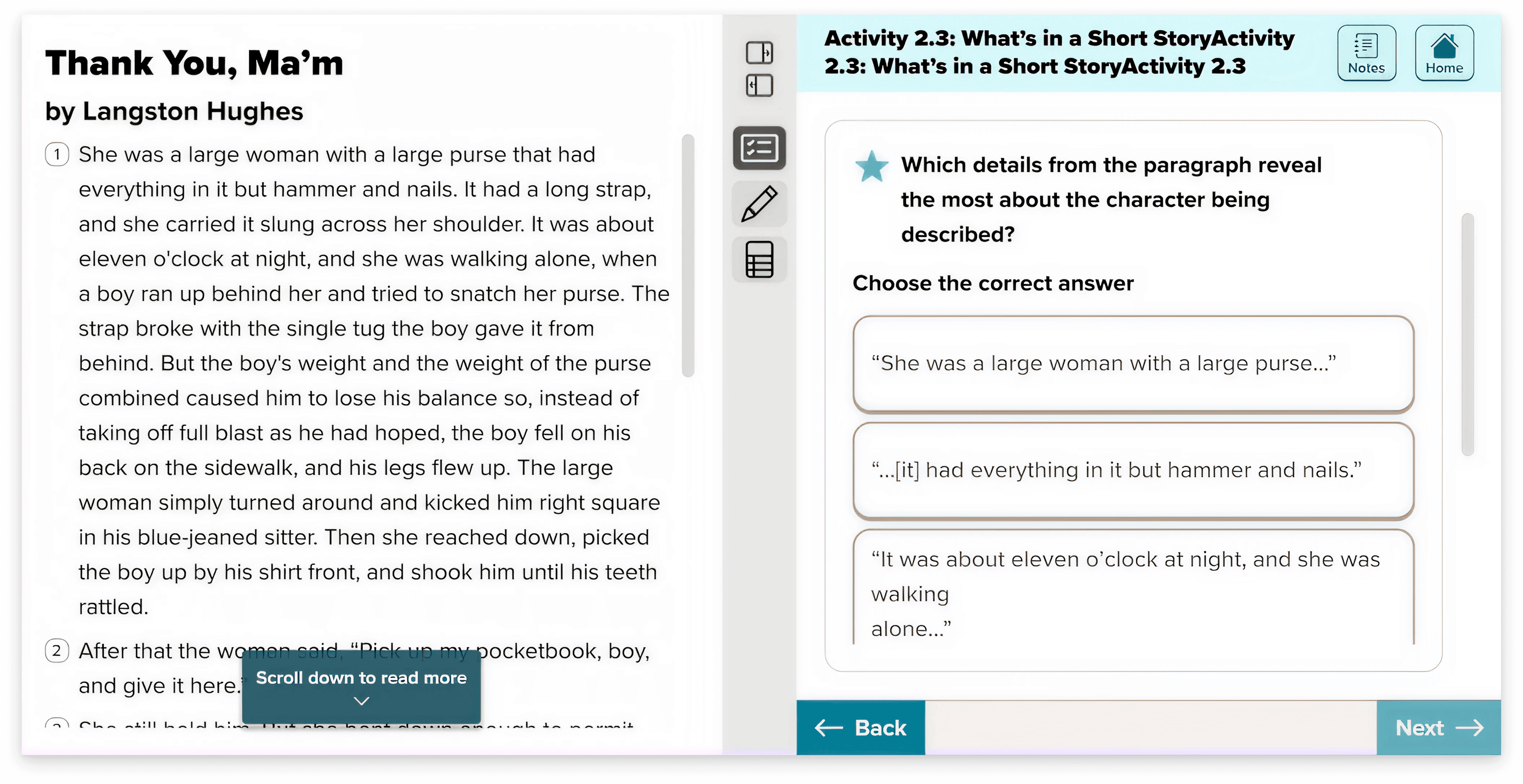
The core of the design was the side-by-side reading experience, but has mentioned before, there were several additional complex layers that made the experience dynamic for students. Below is one example, the annotation tool, which was one of the more complex features.
Annotation Tool
The annotation tool was the most complex component of the project, substantial enough that it could be its own case study. At a high level: it's a floating palette that students can reposition anywhere on screen. When activated, it reveals annotation style options: highlight, underline, box, circle, and comment. Critically, the tool works across both panels. Students can annotate within the passage and within the activity panel, depending on what the instructional context calls for. An author might direct students to "circle all the nouns in the passage" as part of an activity; the tool needs to support that seamlessly wherever the student is working.
Authors control which annotation styles are available to students for any given activity, keeping the tool focused on the instructional goal rather than offering open-ended freedom in every context. The research finding around text selection expectations was directly addressed here, the final interaction model allowed students to select text first and then apply an annotation style, aligning with the mental model they already brought to the experience.
OUTCOME AND IMPACT
The research gave the team high-confidence validation on the decisions that mattered most — and a clear path to handoff.
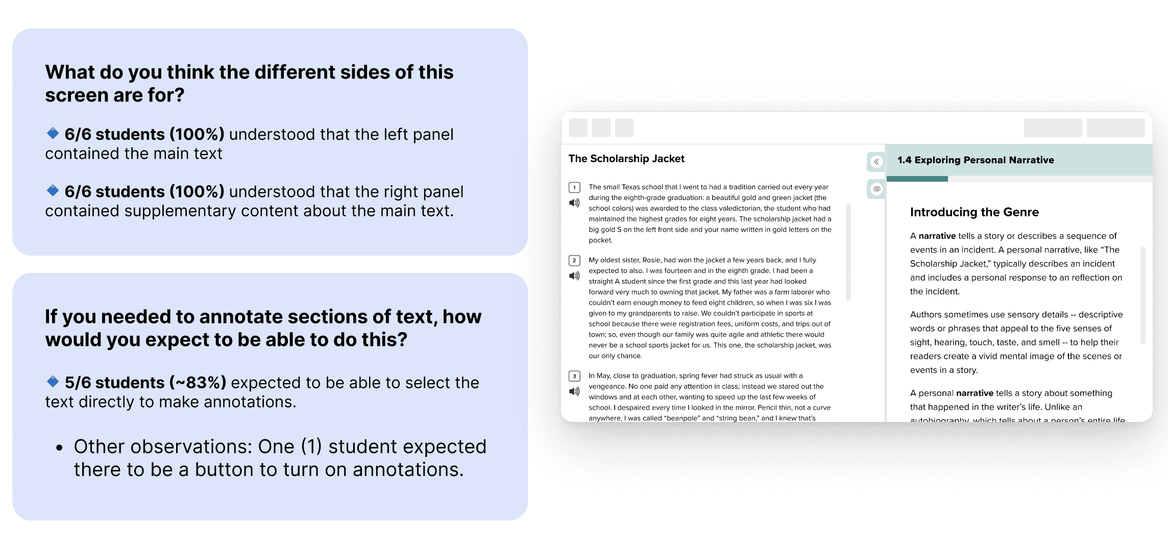
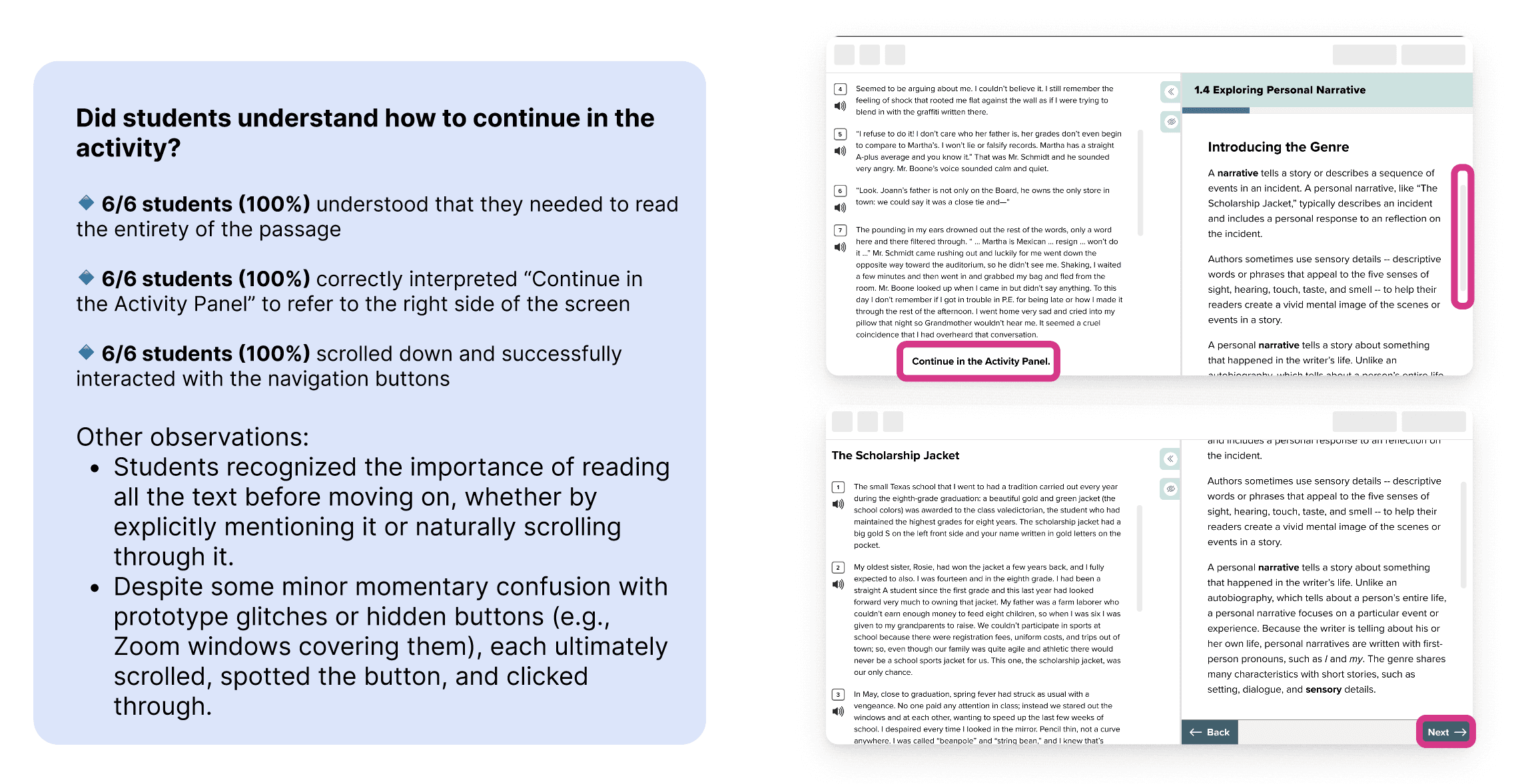
100% of students understood the split-screen layout without instruction
100% understood the gating mechanic and progressed through the activity correctly
83% expected direct text selection for annotation, aligning exactly with the final interaction model
3 targeted design iterations shipped post-research: iconography, tooltips, and anchored backward navigation
Beyond the numbers, the research gave the team internal alignment on decisions like scroll vs. pagination and the necessity of full-screen expansion, not just user validation, but stakeholder confidence in why those decisions were right.
The 6–12 experience shipped as one half of a larger parallel effort alongside a structurally different K–5 product. Because shared features: annotations, audio controls, formatting notices, had to work across both, every design decision made on one track had to hold up against the other. The result was a validated interaction model, a shared component foundation serving both grade bands, and a handoff that engineering could implement without ambiguity.
View Projects
Book a free call