SRA Reading Labs has existed in physical classrooms for over six decades. My aim was to translate the physical product into a digital experience that could work without the teacher in the room, grounded in the product’s literacy pedagogy, with extra learning supports and multi-layered student motivation features.

Product Name
User
Role
Team
The Challenge
A legacy product with decades of trust and a physical-only interaction model
The original SRA Reading Labs is a box of color-coded reading cards at graduated difficulty levels. Teachers loved it because it gave students agency and a tactile, visible system for tracking progress. Digitizing it meant understanding what made it work and rethinking everything the physical medium had handled for free. The digital product had to serve students without a teacher in the room.
Unique challenges included:
The color band progression system had to survive the translation to digital, but without a teacher present to create the rituals that made advancement feel meaningful, the product had to build that motivation in itself.
Color bands encode reading level, which meant every design decision around progression had to feel like forward momentum rather than assessment or ranking against peers.
The experience spanned K–8, so scroll versus pagination wasn't a stylistic preference, it was a usability question that had to be tested with real students at both ends of the age range.
Adaptive logic: mini-lessons, scaffolding, advancement thresholds, had to be communicated clearly through the UI without exposing the machinery in a way that felt clinical or discouraging.
No teacher present to provide encouragement: every motivational moment had to be designed into the experience from the ground up, grounded in how student motivation actually works.
My Role
Sole designer, end-to-end, across the full student experience.
I owned SRA Reading Labs from discovery through engineering handoff:
Onboarding flow
Interest selection system
Reading interface
Mini-lesson and scaffolding interactions
Progress and achievement model
Motion system threading every state
Interstitial and celebration screens connecting each activity section
I collaborated directly with illustration, engineering and the learning design team, co-moderated usability research sessions, and led my own independent discovery research before a single screen was designed.
THE EXISTING PRODUCT
A 60-year-old legacy product, being redefined
The existing physical SRA Reading Labs Product had a defined color band system, self-selection mechanic, and self-checking model. All of it was pedagogically intentional, developed over decades of classroom use. My job was to understand it well enough to know which parts were worth preserving, which were limited by the physical medium, and which could go further in digital.
Interest selection is the clearest example of that last category. A physical card box couldn’t adapt to who a student was. A digital product could and making that the first meaningful interaction of the experience changed what motivation looked like throughout the product entirely. The research gave me the language for why it worked.
An existing digital experience in the Asia Market
My team was not the first to digitalize the SRA Reading Labs product. There was a team on the McGraw Hill Asia digital products team that had already done the process and released their version which is used by 100 million users internationally.
A few noted issues:
Students could not see where they were within the program and the context of the color bands
Book thumbnails and titles were overlapping and overwhelming
Pagination on the shelves did not give students a clear view of all of the readings available to them
Several accessibility issues with keyboard navigation and color contrast
DISCOVERY
Identifying what the market had already solved, and what it hadn’t
I took a deep dive into existing literacy products and how they were tackling the problems that we were trying to solve. When looking at each product I had the following questions:
Progress Tracker: How does the program track student’s progress?
Student Motivation:How does the program provide students encouragement/motivation?
Passage Structure: How does the student interact with the passage, pagination, scrolling, dragging?
Scaffolding/Student Support: How does the program support students who need help with content?
Library/Lessons: How does the program structure their library and/or lessons?
Reception: How have customers reacted to this program?
I first wanted to understand the website structure of each of the products and also the pathways that students took, starting from the selection of a reading, all the way to the end of the reading. I did this for each of the products included in the competitor analysis to have a full holistic view of each product.
After mapping out each of the flows, I then drilled in deeper into the questions I had mapped out, with notes and screenshots of each product. This was then shared out to stakeholders so that they had a frame of reference as well. View the full FigJam competitor analysis: click here
What also interested me was, what do all these products have in common and what was already considered industry standard?
This helped answer the question of, what patterns and interactions might students already be familiar with?
What actually motivates a student to read
I reviewed research on student motivation, self-efficacy, and how felt accomplishment occurs in learning contexts. The findings were counterintuitive in several places and changed how I thought about every motivation-related design decision in the product.
The framework that anchored the work was a four-step model of student self-efficacy. For motivation to take hold, a student needs to:
… understand what they’re trying to learn
…care about the learning goal,
…feel accomplishment progressing toward it, and
…have that feeling motivate further effort.
A student who doesn’t care about the goal can’t feel accomplishment and a student who doesn’t feel accomplishment won’t persevere.
Research showed that students don’t engage with ELA skills, they engage with content. Even skilled 6th graders couldn’t articulate they were working on “Identifying Problem and Solution” after being told repeatedly. Teachers tried explicit instruction, rewards, self-reflection, and games around the skill. None of it changed student engagement. Kids don’t think of themselves as practicing reading. They think of themselves as learning about nature, or sports, or fantasy worlds.
That insight had a direct design implication: the motivation hook had to be content relevance, not skill achievement.
The research also ranked where felt accomplishment naturally occurs in students. The findings were ranked as follows:
beating a peer at a higher grade level ranked first
Redemption after failure
Figuring out a puzzle
Knowing facts you previously didn’t know
And a progress bar filling up ranked last.
This was the research indictment of the most common EdTech motivation pattern, and it shaped every progress-related design decision in the product.
Finding | Perceived growth creates self-efficacy. Reporting actual growth does not. Students who experienced gamified “leveling up” said things like “i-Ready just shows me a bunch of X’s. This you actually learn.” The feeling of winning matters more than the measurement of progress. |
Finding | Students measure difficulty in grade levels, not abstract labels. “This work is a grade level above you” is more motivating than “this is hard.” Color band names , Berry, Teal, Cobalt, sidestep the grade-level comparison entirely without hiding the progression system. |
Design Decision | Relegate actual skill and growth data to the teacher dashboard. For students, design for perceived growth: discrete wins, clear criteria, and immediate reward on completion. Keep reward and growth messaging simple. |
Goal-setting theory as a design framework
I reviewed Locke and Latham’s goal-setting research to understand how goal structure affects performance on complex tasks and reading comprehension is a complex task. Two findings shaped the product architecture directly.
On complex tasks, learning goals consistently outperform performance goals.
Learning Goal | Performance Goal |
|---|---|
"I want to know more about animals." | "I want to get 8 stars." |
Learning goals enhance intrinsic interest and engagement; performance goals improve measurable output but don’t affect interest. Interest selection was the mechanism for building learning goals into the product from the first interaction.
2. Proximal goals are more effective than distal goals on complex tasks.
“Finish Berry, unlock Teal” is more motivating than “work through 22 levels of reading content.” The information architecture of the dashboard, showing only the current band, one locked next band, and My Page, is a direct application of this research. Students see the goal that serves them.
ONBOARDING
Enabling student personal interests drive the learning
When students onboard into the product, they take a placement assessment that establishes their starting color band, and then immediately select their areas of interest: topics and genres they actually care about.
That selection populates their reading library with content relevant to their interests and their library feels curated for them, because it is.
This is self-efficacy step 2 made tangible.
A student who cares about the content has a personal learning goal, not just an assigned task. Goal-setting research shows that personal goals consistently outperform assigned goals on complex tasks. Interest selection makes the reading goal feel owned from the first interaction, before a single word has been read.
THE LIBARY DASHBOARD
A personalized library that shows you where you are
After onboarding, students would enter into the dashboard where they could select their reading and enter into an activity track. There was an already-established color band structure that had to be integrated from the physical product into the digital product:
Directing students to the reading for them
The book thumbnails had to account for the possibility of some gamification elements, but also most importantly: the title and the image of the book.
After presenting initial ideas to the accessibility team, it was agreed that having a title that was separate, below the book would avoid issues with color contrast and legibility. This would also allow for the clear visual stimulus of the book cover and the title would be clearly in view below.
Clear visual layout for optimal visibility of options
I then moved onto the dashboard itself. In total, I did about 25 iterations of the dashboard. This was a continual process because new features and requirements were identified during the design process. Features were either identified as a need from business or sometimes it was identified as we discussed the topic of student motivation and how to best support students in their learning experience and goals.
The tab structure keeps the navigation intentionally narrow: the most recently completed band, the current active band, the next locked band, and My Page. Four tabs. Twenty-two levels. The constraint is the design students see the goal that serves them, and nothing else.
I continued to iterated off of the initial low-fidelity prototypes and then started to add in color since it was a known element of the product that would help drive decision with stakeholders.
As I iterated in the designs, a tab pattern emerged. This was reminicent of the existing physical product and the business team liked the direction to tie the digital product to the original that students and teachers were already familiar with.
I defined 3 Tabs are centered to the page. There were 22 color bands in total, so having the 4 bands helped reduce the cognitive load for the student. Thy were able to see where their current placement was, and the next level, where they were going. Just enough context. And then there was one bonus tab with their achievements to help motivate them further.
There are 4 types of possible tabs:
My Page Tab: This page is the student’s page where they can see what books they have completed and they can also see any badges that they may have earned in the program.
Locked Tab: The locked tab is the next color band that they will have access to once they make their way through the color band that they are currently on. This tab has the lock icon to mark it as locked for the student.
Current Color Band Tab: The current color band tab is the tab in which the student is actively working in.
A progress system designed around how accomplishment actually feels
The star tracker is the motivation research made tangible. Rather than a progress bar, which the research ranked last for generating felt accomplishment, each star represents a discrete win: one reading completed at the proficiency threshold. Students earn stars by demonstrating understanding, which means each lit star carries real meaning.
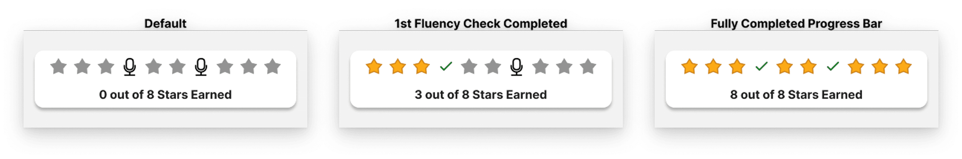
The two fluency checks (students recording themselves reading aloud) embedded in every band add a different kind of challenge to the same system, when a student clears one, the microphone icon converts to a check, a small bonus win that the research identified as one of the most motivating moments a student can experience: accomplishing something after it felt hard.
Taken together, the stars work on two levels: each one is an immediate, felt moment of achievement, and the accumulating row of yellow stars is a visible path toward the larger goal of advancing to the next color band. That's the proximal goals principle in practice, "earn the next star" is always the goal in front of the student, and the next band advances naturally as a result.
MY PAGE
Where comprehensive student progress lives
My Page is the headquarters where students can review and access their achievements; it contains:
Scrollable level map showing completed bands
Current active position
Locked future bands
Bookshelf showing every story finished in the current band
Badges section with earned achievements like Star Streak.
Students visit it when they want to, it’s never pushed at them as the primary interface.
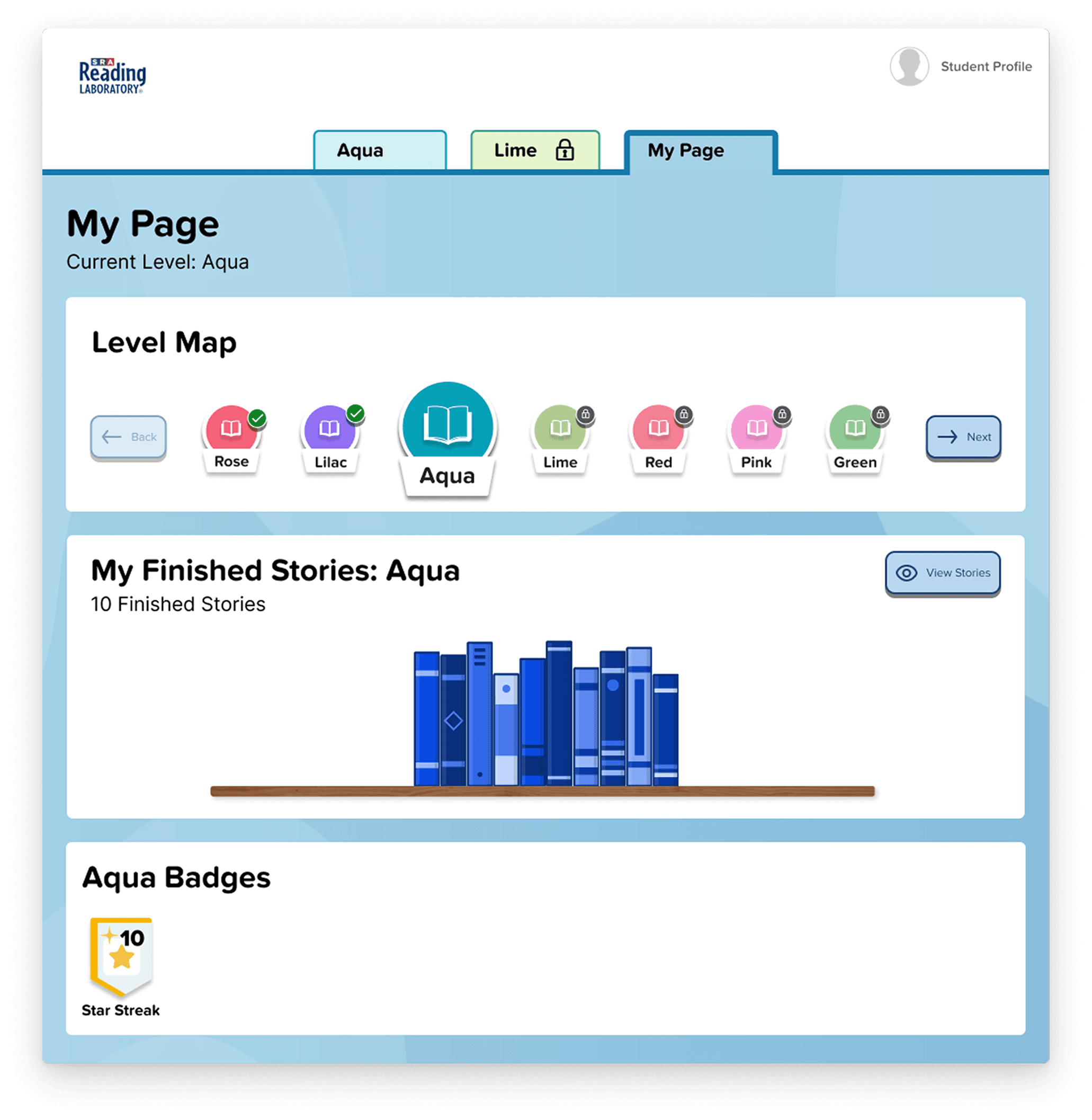
The bookshelf on My Page is a trophy case, not a to-do list. The goal was never to read every book in a band. The goal was to read enough to demonstrate understanding and advance.
A shelf filling up with books you’ve actually read is perceived growth made visual, not a number, not a score, but a tangible record of things you chose and finished.
Badges like Star Streak encode specific, earned accomplishments with their own visual identity, the scout patch model from the design research, not the generic “you leveled up” mechanics that research showed don’t reliably create felt accomplishment.
Maintaining the imagery and theming throughout
The process for designing the, My Page, for students began with pen and paper sketches. The initial idea was that it would be a place that the students could visually recognize and tie to main library concept of a bookshelf. This would be a place where students could see the number of books that they had completed and also see how many levels they had completed. As a team we also discussed the idea that there could be badges that were aligned to the number of books that the student had read or other milestones. However, due to time contraints on this project, the badge concept was deprioritized.
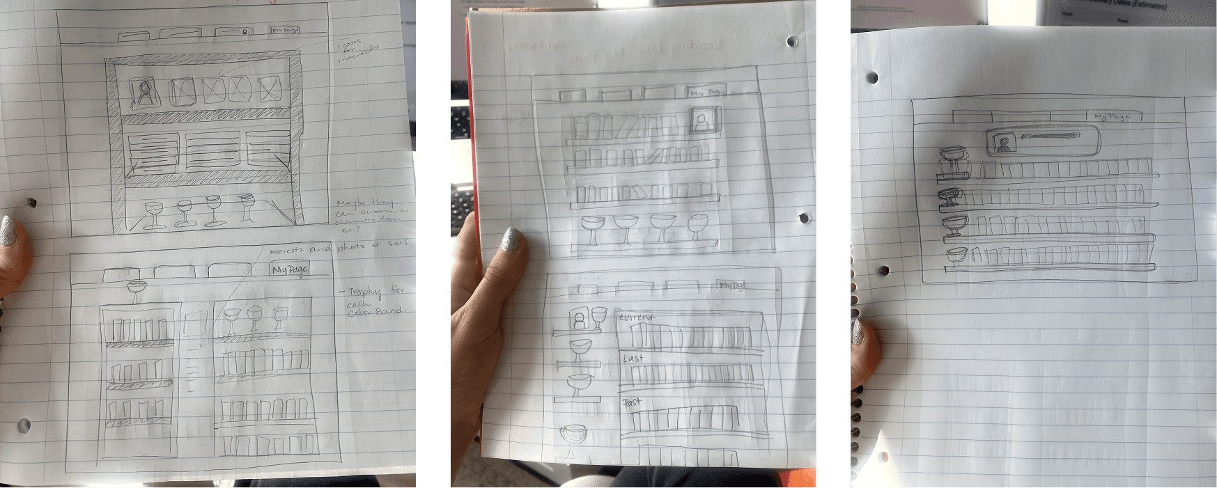
After showing the team the initial sketch ideas, there was a lot of enthusiasm for the concept of maintaining the visualization of books as a grounding theme for the student in the experience as a whole. Younger children especially tend to use literal language and enjoy seeing remnants of the real world in digital experiences, as it helps them relation the more high level concepts to things they recognize. Below are several iterations on this concept:
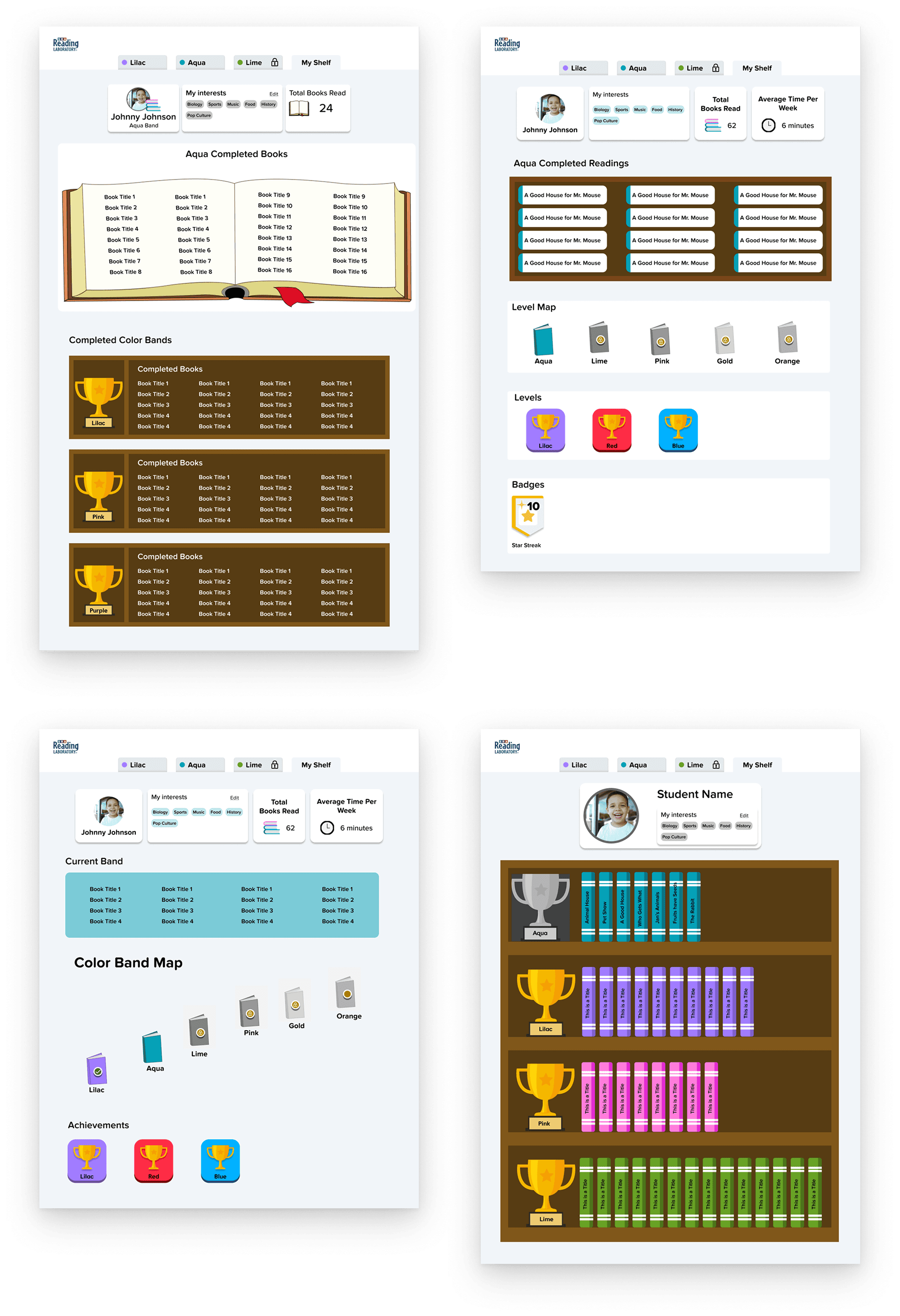
In the end, the design was simplified to the final result, in order to reduce cognitive overload and also to not distract from the main purpose of the program, which was to engage with the readings within the color band tab.
THE READING ACTIVITY
Reducing anxiety with a research-backed progress bar
Although research showed that a progress bar was not a big contributor to student motivation, there still was a need to help guide the students through the lesson and communicate how many pages they had left.
After several iterations on the progress bard, we moved away from a progress bar that felt undefined as to how many activity pages the student had left. This led to the iterations on a individual-pill progress bar that would communicate to the student both visually and with text, how many activity pages that they had left.
This decision was also supported through recommendations from the research team who had previously done research on progress bars with students and they reported that there was an increase in student anxiety when a progress bar seemed ambiguous, and they could not tell accurately how much work they could expect.
Once the direction was defined, it came down to deciding on use of color for communication. The first option with the correct/incorrect icons and use of green and red was decided against due to a concern that it would be de-motivating to the student to constantly see the red or "x" while in the activity if they got a page wrong.
Here is where color theory and color meaning came into play. Yellow communicated a message of warning or incompleteness and green communicate correctness. In the end stakeholders and I agreed unanimously with the blue since it was a neutral color in relation to correctness and also is a color that does not induce as much anxiety or alert as say, a pink.

This progress bar was then tested with students and resulted in a 100% understanding from users regarding what it was trying to communicate as well as the students were able to explain where they were in the lesson.
Encouragement along the way
As students progressed through the activity, they were met with messages of encouragement at each point that they finished an activity section. They could see the section that they completed receive a check mark and then the next section unlock for them to continue on. This helped give them a sense of where they were in the program and their current goal of finishing the activity, while also allowing for a cognitive break between exercises.
OUTCOMES & IMPACT
The digital product I designed shares exactly those goals: developing comprehension, vocabulary, fluency, word analysis, and independent reading confidence; building reading for pleasure; and fostering the kind of personal accountability that comes from a student choosing what to read, doing the work, and seeing themselves grow. Interest selection, adaptive pacing, personalized progress visibility, and motivation architecture designed around how students actually experience achievement: none of that exists in a box of paper cards.
Shipped ahead of schedule, as the sole designer across the full student experience, across two distinct layout and interaction models, with WCAG AAA compliance embedded throughout. The program’s outcomes have been proven at scale for six decades. My job was to make sure the digital version was worthy of them.
WHAT I LEARNED
Legacy products are a different kind of design challenge
The color band system, the self-selection mechanic, the self-checking model was pedagogically intentional, developed over decades of classroom use. My task was to understand it well enough to know which parts were worth preserving, which were limited by the physical medium, and which could go further in digital.
Interest selection is the clearest example of that last category. A physical card box couldn’t adapt to who a student was. A digital product could, and making that the first meaningful interaction of the experience changed what motivation looked like throughout the product entirely. The research gave me the language for why it worked.
Student motivation is ownership-based
Designing for student motivation when no teacher is in the room is one of the hardest problems in EdTech and most products solve it by borrowing mechanics from games that do not actually work for learning. This project pushed me to go back to the research: on self-efficacy, on goal-setting theory, on what makes students persist. What I learned is that motivation follows ownership, when a student chooses what they read, sees only the goal directly in front of them, and has a clear moment of "I did it" rather than an incremental forward movement, they keep going. That became the design principle behind the decisions in the product and also helped keep the team/stakeholders aligned.
View Projects
Book a free call